PIC Insights
25/04/2026
What does it cost to know?
So, since mid-March, the Power Instantaneous Consumption system has been gathering data, i.e. pulses. Quite a lot, actually: more than 815,000 in 42 days (an average of roughly 19,000 daily).
That harvest does not come for free. Indeed, MID pulse counters themselves draw some power, as do the micro-controllers and the Raspberry Pi that gathers the data and runs the web server to display it.
Thus the first interesting question is: what are the additional costs?
The PIC system relies on:
- the 36 MID pulse counters,
- a Raspberry Pi 5 (with an NVMe drive),
- a USB hub that also powers the Tiny2040s
The 36 MIDs' power draw
The power drawn daily by the MIDs is deduced from the difference between the sum of the power consumptions reported by the 35 MIDs (one for each breaker) and the power consumption reported by the MID tapped on the overall electrical consumption. The result is an average of 17 Wh daily per MID. That amounts to 224 kWh annually (48€ at the current price of 0.21277€/kWh).
The Raspberry Pi's power draw
The Raspberry Pi is powered by the MeanWell connected to the office left shutter breaker. Comparing the power drawn by it to the right office shutter gives a rather good approximation of the power drawn by the MeanWell itself: an average of 107 Wh per day, i.e. 39 kWh annually (8.30€).
The Tiny2040s' power draw
The four Tiny2040s are powered by a dedicated power supply plugged into one of the basement outlets. The MID pulse counter for it reports an average base consumption of 5.59 kWh for 10 days, i.e. 204 kWh annually (43€). But that takes into account a freezer also plugged in the basement outlets. A more accurate estimation suggested by Grok is a power draw of 7 W, i.e. 61.3 kWh annually (13€).
PICs' power draw
Thus there is an annual additional cost of 324.3 kWh (69€) just to know where the electrical power goes. The PIC system would do well to help save more than 400 kWh annually!
Where does the power go?
Exploring the data
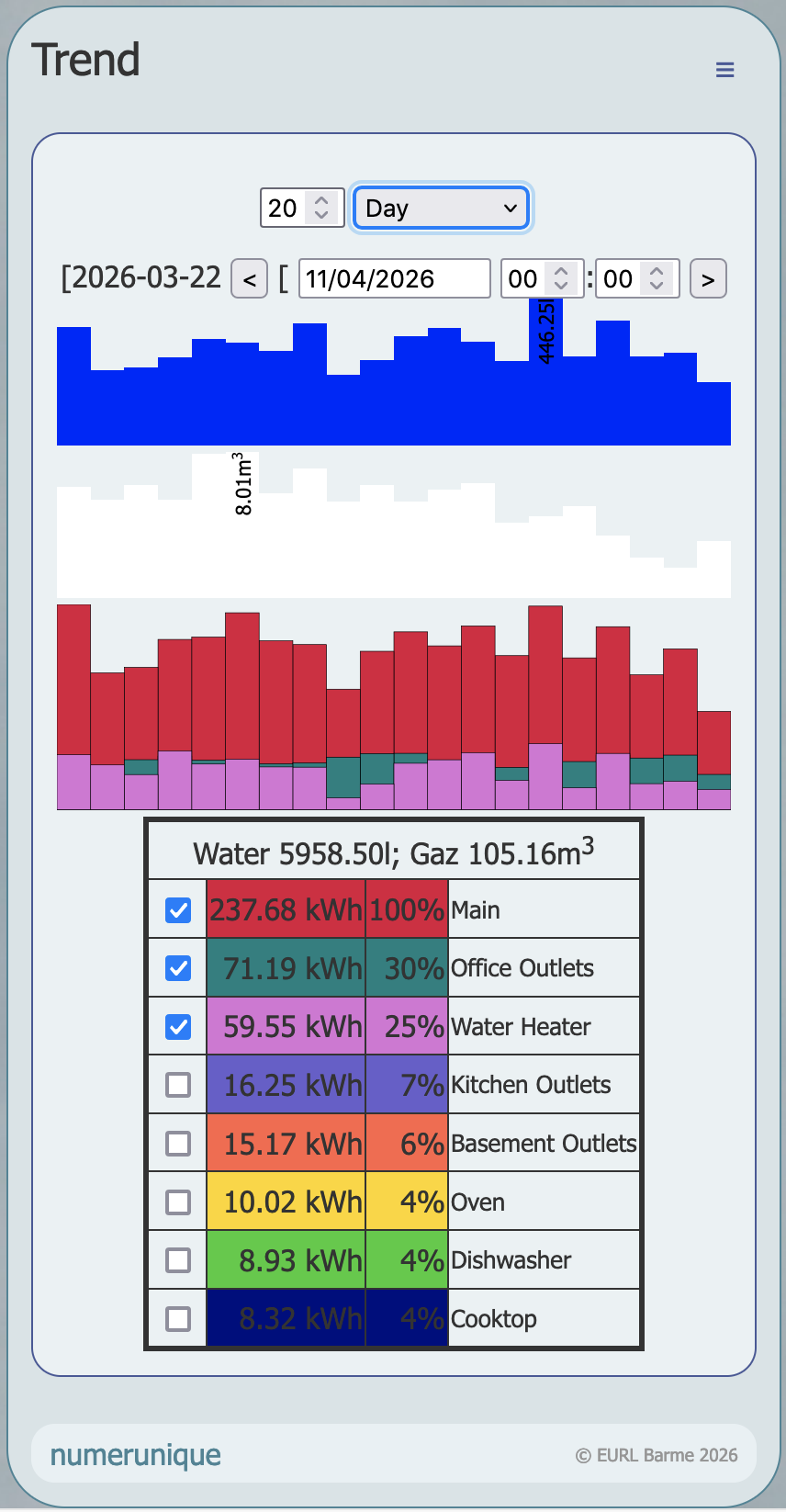
The screenshot above shows the interfaces eventually designed to analyse the power consumption and find how to efficiently reduce it.
A set of form's inputs let you choose the length and precision and select the period analysed. Then three graphs display respectively the water, gas and electric consumptions. The latter overlays several detailed consumption selected from the table beneath. The table lists the overall consumption and the main causes of power draw, ordered by descending importance and up to a total of 80% of the overall consumption.
This example reveals a surprising fact: the most consuming elements are plugged into the office outlets! It also confirms an expected result: the water heater is the main energy drain, directly linked to water consumption. The gas graph will undoubtedly be more interesting in winter when it will show the effects of heating.
Zooming in to see what is behind
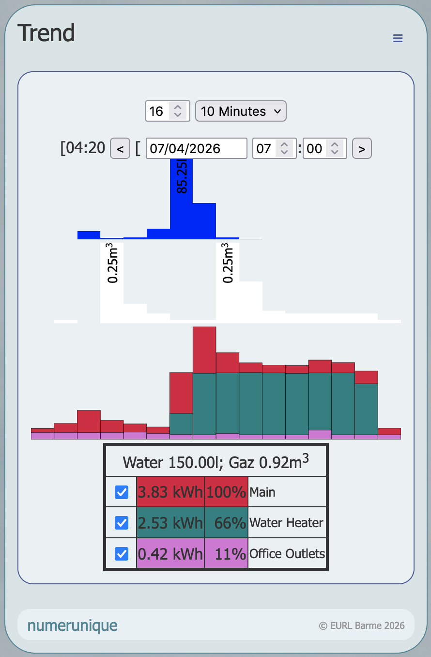
At 10-minute resolution, the consequence of a luxury shower of about 20 minutes is a noticeable heavy water heater consumption of 1h20…
This is somehow blurred by a bath taken in parallel that takes its hot water from the boiler consuming gaz, as shown above.
Lessons learned so far
Consuming hot water is what drains the most energy.
A detailed analysis of the devices plugged in the office (an inverter, computers, network devices…) is required to understand why they compete with the water heater.